The number of craft breweries in the U.S. continues to grow, with, according to a report in CraftBeer.com, nearly 7,500 “active small and independent operating” breweries. Further, they estimate that that number could grow to more than 10,000 in the near future. Given these figures, with a conservative estimate of individual releases by each existing year, there could be up to 100k – or more – craft beers hitting the shelves and tap rooms in 2020.
If you, like I, are tasked with designing a craft beer label (or more than a dozen in the last year), you’ve probably figured out that the struggle is, in fact, real. You have to be unique. You’ve got to have “shelf appeal.” You need to be on brand (most of the time, anyway) so loyalists will recognize the product as one of their favorites.
So, what’s a designer to do when tackling a fun project in an extremely crowded market? How can you create a label that is eye-catching on increasingly jam-packed shelves? Without scanning through thousands upon thousands of competitors’ labels (as we’re sure some collectors and self-appointed craft beer aficionados do), how can you ensure you’re being original?
Being one of the judges in the inaugural Craft Beer Marketing Awards recently has given me an opportunity to see how dozens of breweries across the country have tackled can and label design for new releases and refreshes of year-round offerings – and with that came a fresh perspective into the process itself.
STYLE MATTERS – LITERALLY AND FIGURATIVELY
When something is in fashion, a lot of brands will follow suit. No doubt Other Half Brewing has an incredible identity, but they are somewhat of a cult brand (in a good way). A new release creates lines down the block for hours and their cans are known for their (once) singular style. However, there is now a proliferation of breweries churning out eerily similar labels without that large and knowledgeable following for every new brew, creating confusion among consumers browsing the aisles for their next great craft experience. I recently watched as my wife wandered the craft selection at a local distributor looking for a sour only to emerge empty handed. Why? She couldn’t discern most craft offerings from one another. Further, a lot of these labels buried the lede – i.e., the style of the beer was not immediately evident. This resulted in a lost sale for the brewery AND the distributor. Be clever, but be clear even to craft neophytes. One can make someone a devoted fan of your brand.
DESIGN SYSTEM VS. NO SYSTEM
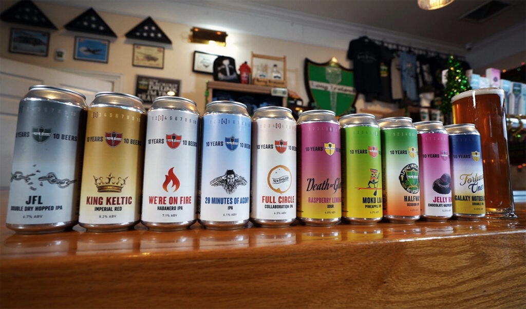 Photo credit: Long Ireland Beer Company patron
With the explosion of craft beer over the last couple decades, a conversation is emerging, usually among designers and branding professionals. Are you moving away from being a true craft brewery if your identity is too rigid? Too corporate? Do you want each beer’s packaging to be unique from the others? Or do you want to lean into solid brand recognition at a consumer level, making it easy for them to find and purchase your product? I can’t answer that for you, but I CAN tell you that you can meet in the middle. Consider creating a series that has its own design system that can apply to each release in it while still allowing for creativity in naming, palettes, and more. At Long Ireland Beer Company, we released 10 beers for 10 years, with each brew having a singular story around it. I leaned into a design system that would unify the series (which, in fact, now goes to 11) while allowing each release’s identity to shine through.
THINK BEYOND THE LABEL
I may be stating the obvious, but your design has to transcend the label and apply across all relevant mediums – Instagram, coasters, point-of-sale, handles, pint glasses, etc.
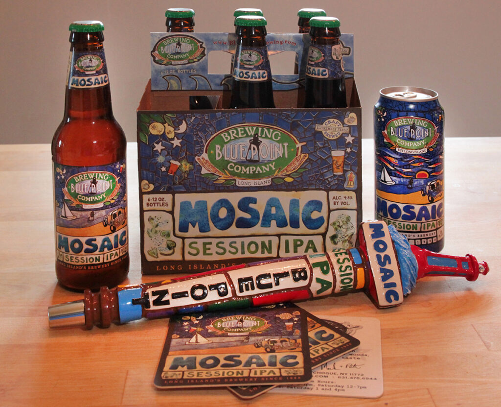
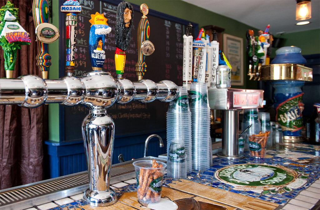
If you can, at the outset of your process, be careful to consider the challenge of fitting all the pieces of the beer’s story together. It’s even okay to be a bit on the nose in telling that story. When I was director of branding and comms at Blue Point Brewing Company, co-founder Mark Burford was ahead of the curve in brewing a mosaic hop session IPA. He and his partner, Pete Cotter wanted to blow out the release and go all-in on all touch points and merch. It was a challenge, but, ultimately, the answer was, in fact, right under my nose. Or, rather, under my glass. Burford’s wife Alicia had created an incredible bar top that told the story of brewing and Blue Point in – you guessed it – mosaic. The motif was instantly recognizable to regulars, having become something of a touchstone over their many years in business, it translated well across all touchpoints, and the style of the beer was instantly obvious.
So, what’s the lesson here? Research your market. Consider everything from your beer’s name to the hops or special ingredients going into the beer. Do your homework on competitive brands and their beers. Think about how a simple label or can design fits into your overall branding and messaging itself. Apply the design principles you’ve been trained to use. And, above all, have fun…it’s craft beer!